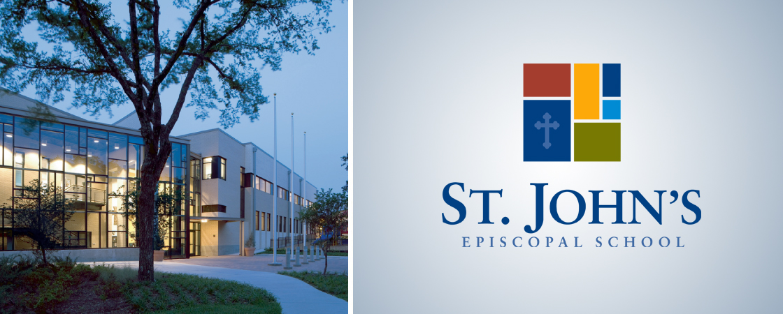
In 2008 my oldest child started at St. John’s Episcopal School. The school is on the “far side” of White Rock Lake, tucked in a quiet East Dallas neighborhood on a campus with tall trees and a meandering creek. St John’s was everything we were looking for in a school – small and friendly, academically strong yet nurturing. Unfortunately, the existing logo and website did a very poor job of selling it.
Sometimes we get a client who has a product or service that doesn’t quite live up to its promise. St. John’s was just the opposite. They had an incredible product – they just needed to upgrade their marketing materials to match. Luckily, I wasn’t the only person at the school tortured by this. In 2009 I got a call – the school was forming a Communications Committee to define the school’s mission statement and upgrade their marketing materials. Was I interested?
Six months later, after dozens of meetings with each other, school leadership and the board, we unveiled a new school logo. Vibrant and colorful like the school itself, the six blocks mimic the Mondrian-like wall of window panes at the entrance of the school.
Design by committee is never easy, but I’m happy with the progress we made and the finished mark. It’s been fun to see it applied throughout the school – from car decals to sweater patches to even a sand-blasted concrete walkway. Plus, my two girls are pretty proud that their Dad designed their school’s logo. How cool is that?


