As a graphic designer, I’m kind of militant about typography (as I should be).
I tried to watch Mad Men, but the fact that they use typography from the 1990’s in a show set in the 1950’s made my head spin. I find myself critiquing and visually adjusting the letter spacing of almost every sign or logo I see. And don’t even get me started on the very obvious, yet almost-always-ignored difference between an apostrophe and foot mark.
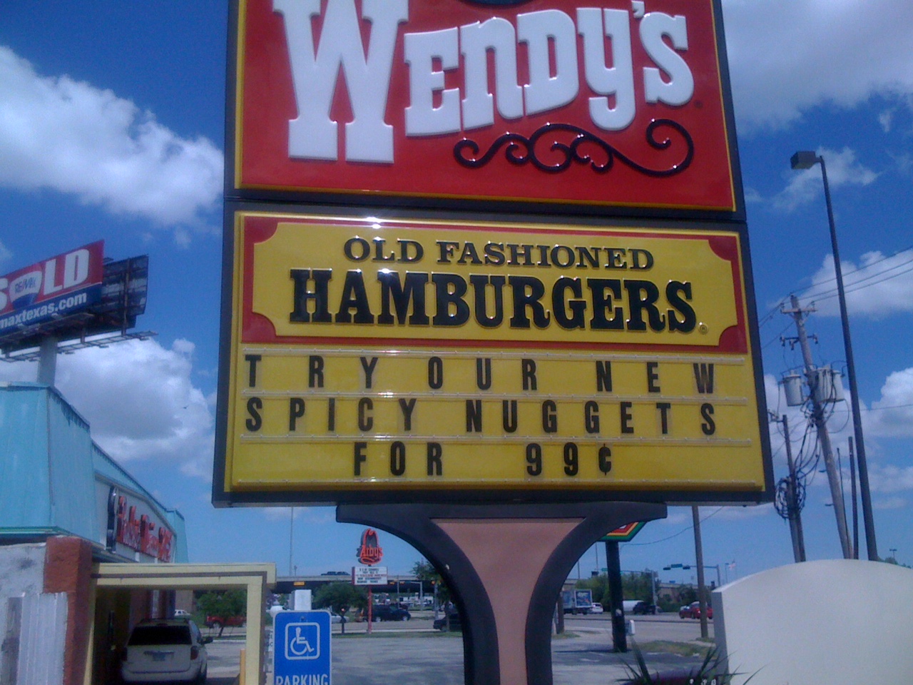
Saddled with this curse, I walk through life cringing at a seemingly unending stream of typographic offenses. For example, take this sign at a local fast food eatery. I’m all for a little letter-spacing, but this is ridiculous:
And speaking of spacing, here’s a great example of how dramatically the meaning of a sign can change with one missing stroke of the keyboard:

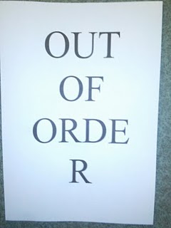
And then there’s this. I don’t even know what to say about this. I certainly don’t expect professional typography on every printed piece I see, but c’mon? Even the most brain-dead office admin can figure out how to adjust the type size just a bit so it will all fit on one line, right?: